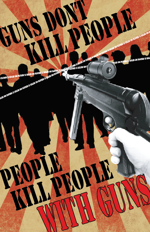
TITLE: Propaganda Poster
MEDIA: Graphic Design
SOFTWARE: Adobe Illustrator
HARDWARE: iMac Os X
SPECIFICATIONS: 2674 x 3570
CLASS: ART 210 Foundations: Digital Media
PROFESSOR: Brian Tortorelli
SEMESTER / TERM: FA 17
INSTITUTION: University of Tampa
DESCRIPTION: I remember my biggest concern with this project was the printing process. I actually got it finished decently quickly and before the due date while feeling good about it, but I was nervous what the people at the copy place would say. Thankfully, they actually liked the message quite a bit, but it was still incredibly anxiety inducing. Probably one of my better final projects from this class, so I can at least say the freak out was worth it.
LINK: https://tiramysu.blogspot.com/2017/10/i-like-idea-of-propaganda-project-lot-i.html
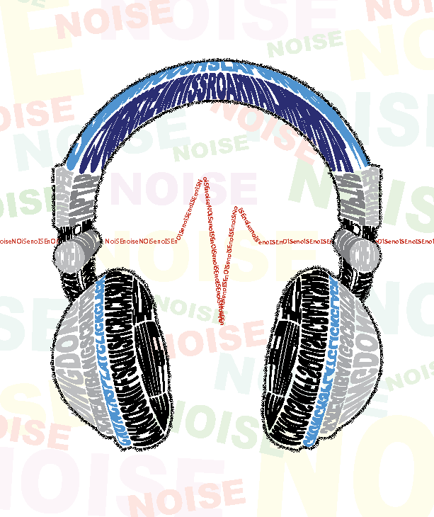
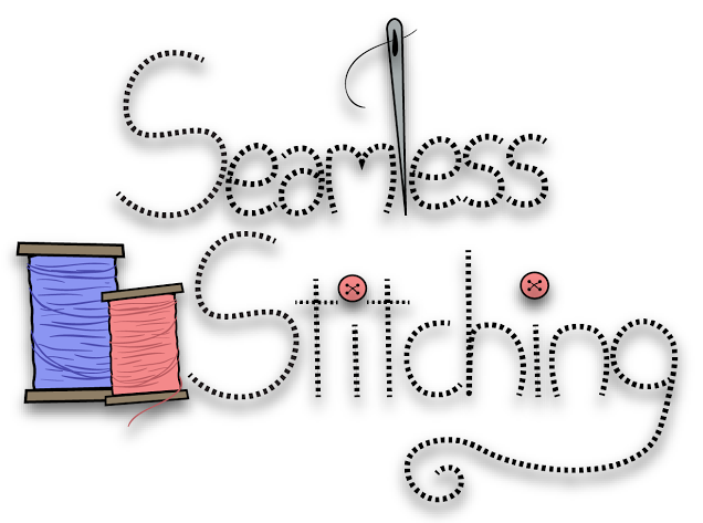
TITLE: Calligram
MEDIA: Graphic Design
SOFTWARE: Adobe Illustrator
HARDWARE: iMac Os X
SPECIFICATIONS: 613 x 730
CLASS: ART 210 Foundations: Digital Media
PROFESSOR: Brian Tortorelli
SEMESTER / TERM: FA 17
INSTITUTION: University of Tampa
DESCRIPTION: Thought this project would be easy until one of the restrictions was we had to use our own text. Wound up making it more thematic rather than trying to write a poem. This piece still means a lot to me because I’ve always had rather sensitive hearing so I tried to convey what that kind of over-stimulation felt like.
LINK: https://tiramysu.blogspot.com/2017/09/working-on-calligram-for-first-time-was.html
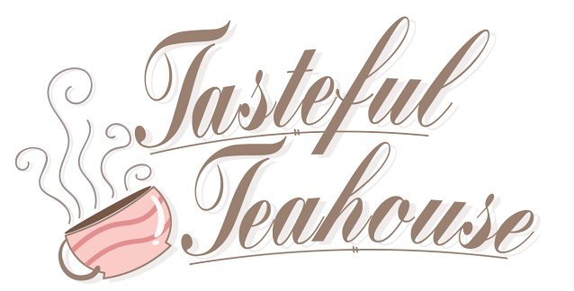
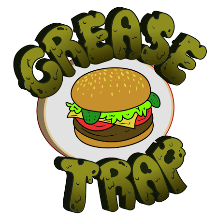
TITLE: Logos
MEDIA: Graphic Design
SOFTWARE: Adobe Illustrator
HARDWARE: iMac Os X
SPECIFICATIONS: 2550 x 3300
CLASS: ART 210 Foundations: Digital Media
PROFESSOR: Brian Tortorelli
SEMESTER / TERM: FA 17
INSTITUTION: University of Tampa
DESCRIPTION: Probably my favorite project of the entire class. This was the closest I got to the kind of design I do in my free time, so it was fun coming up with the logo designs. The grease trap one is by far my favorite, since I got the do the font myself. Although, it also wound up being the one that took the most time, so I had to stick to making the font more simplistic in the other two. I guess if nothing else, it taught me time management skills.
LINK: https://tiramysu.blogspot.com/2017/10/i-really-liked-idea-of-creating-logos.html